Trucker 247 Strong – Smarter Logistics on the Road
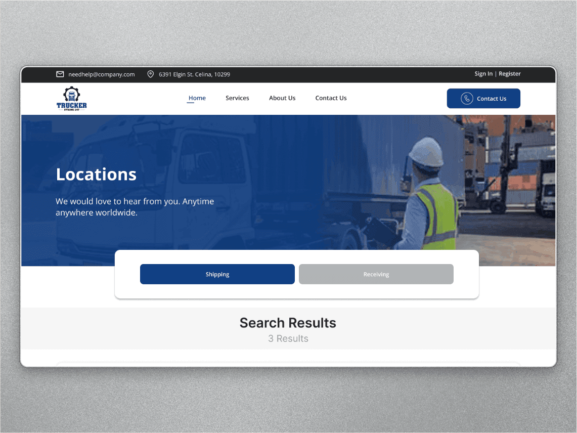
The Challenge: Truck drivers waste time juggling multiple apps to track shipments, find loading docks, and verify delivery locations. Trucker 247 Strong needed a mobile app that consolidates all critical logistics tools into one interface—designed for quick access while on the road.
Year
2024
Services
UI/UX Design
Client
Flux Genesis
/ Concept
My Approach: I started by mapping the driver's workflow from dispatch to delivery, identifying pain points where they had to switch apps or pull over to look up information.
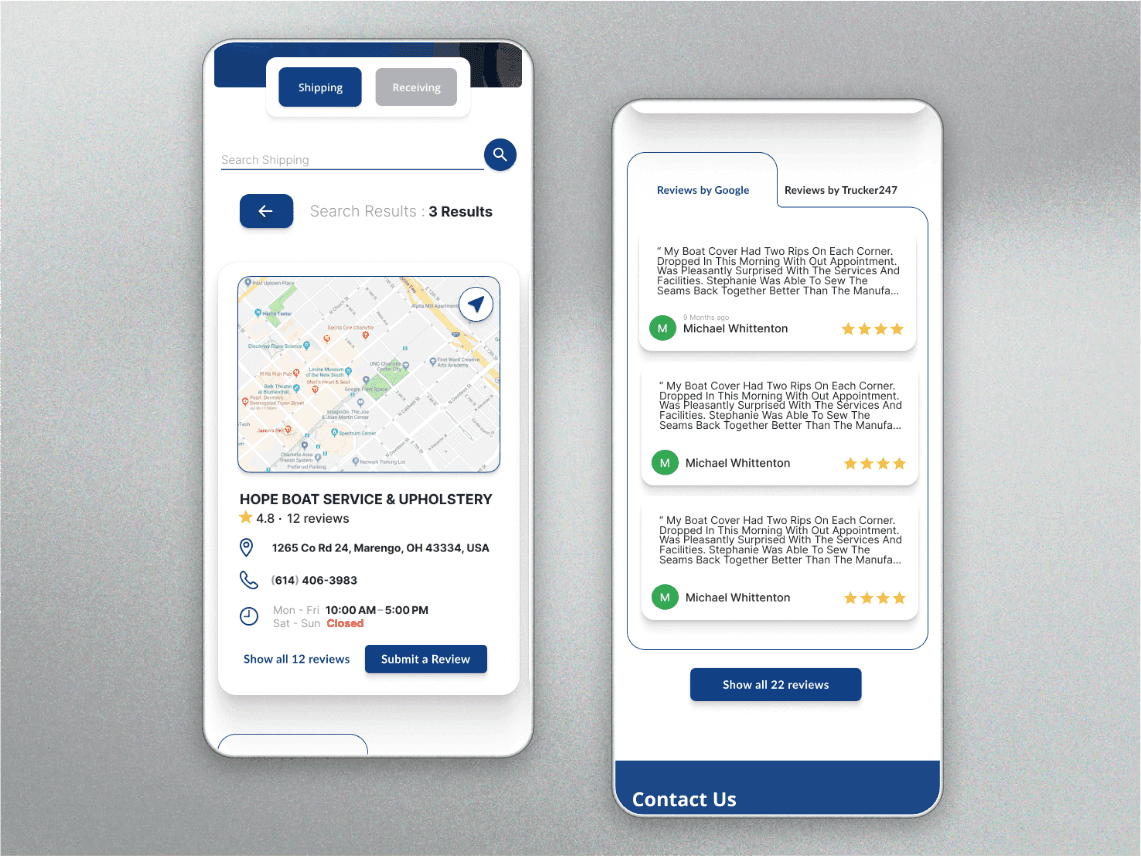
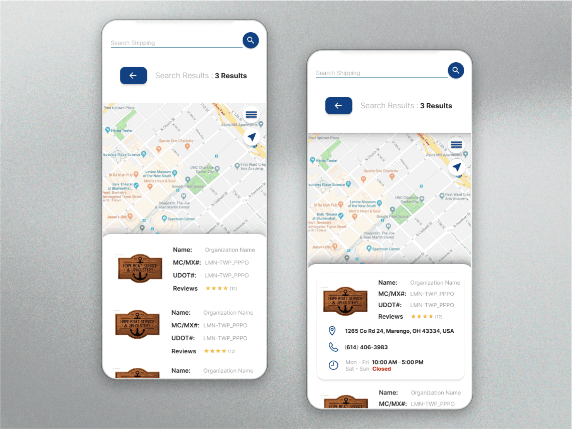
The design goal was to create a glanceable, map-first interface where drivers could access delivery details, partner reviews, and tracking info without digging through menus—reducing cognitive load and keeping them moving safely.
/ Design
Challenge | Design Solution |
|---|---|
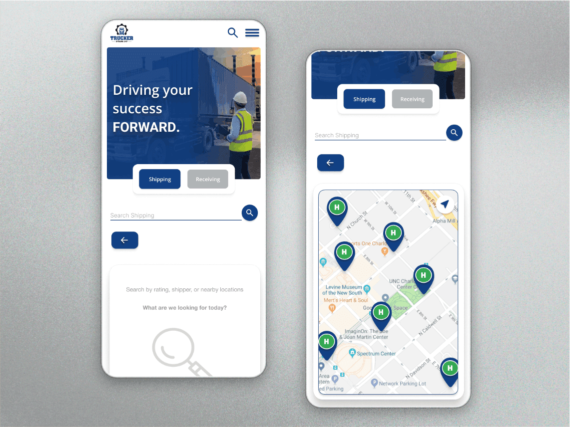
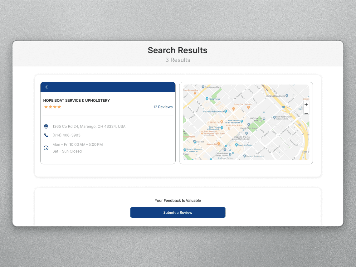
App-Switching Friction: Drivers toggled between 3-4 apps (Google Maps, carrier portals, phone) during each delivery. | Built a map-first dashboard that surfaces delivery cards, partner locations, and tracking info in one view—no need to leave the app. |
Hard-to-Read Info While Driving: Small text and cluttered screens made it unsafe to check details on the road. | Used large touch targets, high-contrast cards, and a clear visual hierarchy so drivers could glance at key info (address, contact, ETA) without squinting or scrolling. |
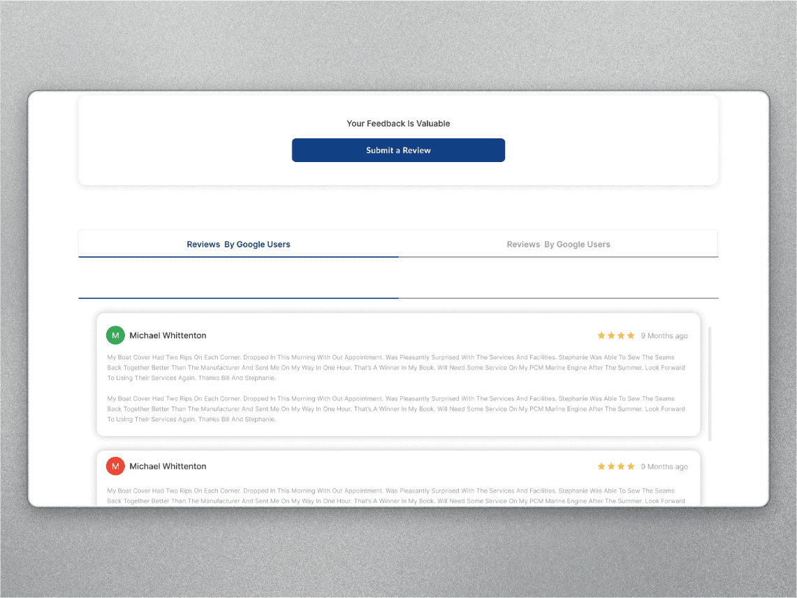
No Partner Visibility: Drivers had no way to vet loading docks, warehouses, or service stops before arriving. | Added a review system where drivers can rate and read reviews about logistics partners—helping them avoid delays and find reliable services. |
Buried Tracking Info: Shipment tracking was 3+ taps deep in most carrier apps. | Designed a quick-access shipment tracker that shows real-time status on the home screen, with one-tap drill-down for details. |
/ Result
Outcome:
Consolidated workflow: Drivers now access maps, delivery details, reviews, and tracking in one app instead of 4+ separate tools.
Faster decision-making: Map-first layout and glanceable cards let drivers verify delivery info without pulling over or digging through menus.
Improved partner transparency: Review system helped drivers identify reliable loading docks and avoid delays, building trust in the platform.
Mobile-optimized for safety: Large touch targets and high-contrast design made the app usable at a glance, reducing distraction while driving.
Client approved for development: Flux Genesis moved forward with the design, citing the intuitive UX and driver-focused approach.
Trucker 247 Strong – Smarter Logistics on the Road
The Challenge: Truck drivers waste time juggling multiple apps to track shipments, find loading docks, and verify delivery locations. Trucker 247 Strong needed a mobile app that consolidates all critical logistics tools into one interface—designed for quick access while on the road.
Year
2024
Services
UI/UX Design
Client
Flux Genesis
/ Concept
My Approach: I started by mapping the driver's workflow from dispatch to delivery, identifying pain points where they had to switch apps or pull over to look up information.
The design goal was to create a glanceable, map-first interface where drivers could access delivery details, partner reviews, and tracking info without digging through menus—reducing cognitive load and keeping them moving safely.
/ Design
Challenge | Design Solution |
|---|---|
App-Switching Friction: Drivers toggled between 3-4 apps (Google Maps, carrier portals, phone) during each delivery. | Built a map-first dashboard that surfaces delivery cards, partner locations, and tracking info in one view—no need to leave the app. |
Hard-to-Read Info While Driving: Small text and cluttered screens made it unsafe to check details on the road. | Used large touch targets, high-contrast cards, and a clear visual hierarchy so drivers could glance at key info (address, contact, ETA) without squinting or scrolling. |
No Partner Visibility: Drivers had no way to vet loading docks, warehouses, or service stops before arriving. | Added a review system where drivers can rate and read reviews about logistics partners—helping them avoid delays and find reliable services. |
Buried Tracking Info: Shipment tracking was 3+ taps deep in most carrier apps. | Designed a quick-access shipment tracker that shows real-time status on the home screen, with one-tap drill-down for details. |
/ Result
Outcome:
Consolidated workflow: Drivers now access maps, delivery details, reviews, and tracking in one app instead of 4+ separate tools.
Faster decision-making: Map-first layout and glanceable cards let drivers verify delivery info without pulling over or digging through menus.
Improved partner transparency: Review system helped drivers identify reliable loading docks and avoid delays, building trust in the platform.
Mobile-optimized for safety: Large touch targets and high-contrast design made the app usable at a glance, reducing distraction while driving.
Client approved for development: Flux Genesis moved forward with the design, citing the intuitive UX and driver-focused approach.
Trucker 247 Strong – Smarter Logistics on the Road
The Challenge: Truck drivers waste time juggling multiple apps to track shipments, find loading docks, and verify delivery locations. Trucker 247 Strong needed a mobile app that consolidates all critical logistics tools into one interface—designed for quick access while on the road.
Year
2024
Services
UI/UX Design
Client
Flux Genesis
/ Concept
My Approach: I started by mapping the driver's workflow from dispatch to delivery, identifying pain points where they had to switch apps or pull over to look up information.
The design goal was to create a glanceable, map-first interface where drivers could access delivery details, partner reviews, and tracking info without digging through menus—reducing cognitive load and keeping them moving safely.
/ Design
Challenge | Design Solution |
|---|---|
App-Switching Friction: Drivers toggled between 3-4 apps (Google Maps, carrier portals, phone) during each delivery. | Built a map-first dashboard that surfaces delivery cards, partner locations, and tracking info in one view—no need to leave the app. |
Hard-to-Read Info While Driving: Small text and cluttered screens made it unsafe to check details on the road. | Used large touch targets, high-contrast cards, and a clear visual hierarchy so drivers could glance at key info (address, contact, ETA) without squinting or scrolling. |
No Partner Visibility: Drivers had no way to vet loading docks, warehouses, or service stops before arriving. | Added a review system where drivers can rate and read reviews about logistics partners—helping them avoid delays and find reliable services. |
Buried Tracking Info: Shipment tracking was 3+ taps deep in most carrier apps. | Designed a quick-access shipment tracker that shows real-time status on the home screen, with one-tap drill-down for details. |
/ Result
Outcome:
Consolidated workflow: Drivers now access maps, delivery details, reviews, and tracking in one app instead of 4+ separate tools.
Faster decision-making: Map-first layout and glanceable cards let drivers verify delivery info without pulling over or digging through menus.
Improved partner transparency: Review system helped drivers identify reliable loading docks and avoid delays, building trust in the platform.
Mobile-optimized for safety: Large touch targets and high-contrast design made the app usable at a glance, reducing distraction while driving.
Client approved for development: Flux Genesis moved forward with the design, citing the intuitive UX and driver-focused approach.